
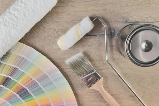
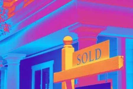
Paint Colors That Instantly Make a Home Look More Expensive
 An elevated home doesn't rely on square footage alone-it's the details that create a sense of refinement. One of the most powerful and cost-effective ways to achieve a high-end look is through strategic paint choices. Color sets the emotional tone of a space, influences how light moves, and signals quality before a single piece of furniture is noticed.
These paint color approaches consistently deliver a more luxurious, designer-level finish.
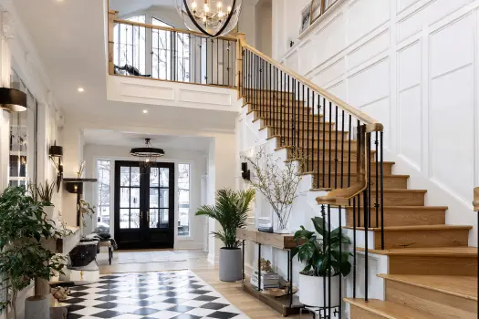
Deep Neutrals Create Instant Sophistication
Soft whites have their place, but deeper neutrals add dimension and depth that lighter shades often lack. Rich taupes, warm charcoals, and layered greige tones create a grounded, intentional feel that reads custom rather than generic. These colors absorb light just enough to add warmth while still keeping rooms open and inviting.
Used correctly, deep neutrals provide a timeless backdrop that allows architectural details and furnishings to shine.
Muted Blues Signal Calm and Confidence
Blue tones with gray or slate undertones bring a sense of quiet luxury. Unlike bright or overly saturated blues, muted variations feel refined and tailored. They work exceptionally well in bedrooms, libraries, dining rooms, and bathrooms-spaces where tranquility and elegance matter most.
These shades create a sense of permanence and stability, often associated with higher-end homes.
Earthy Greens Feel Collected and Intentional
Green continues to be a standout color for elevated interiors, particularly when drawn from nature. Olive, sage, and moss-inspired hues add warmth without overpowering a room. These tones pair beautifully with wood, stone, and natural textiles, reinforcing a curated, well-traveled aesthetic.
Earthy greens suggest thoughtful design and an appreciation for organic materials-both hallmarks of luxury spaces.
Warm Whites Outperform Stark Whites
Not all white paint creates the same effect. Stark, cool whites can feel flat or unfinished, while warmer whites with creamy or soft beige undertones bring depth and softness. These shades reflect light gently, creating rooms that feel bright but still layered and welcoming.
Warm whites also photograph beautifully, making them especially effective in open living areas and primary spaces.
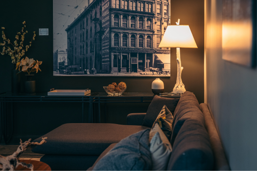
Dark Accents Add Designer-Level Contrast
Incorporating dark paint strategically-such as on doors, trim, built-ins, or accent walls-adds contrast that feels intentional and custom. Shades like soft black, deep espresso, or charcoal define architectural elements and give a space visual weight.
This contrast creates a tailored look often seen in professionally designed homes.
Consistency Matters More Than Trend
Homes that feel expensive rarely rely on bold trends. Instead, they use cohesive color palettes that flow seamlessly from room to room. Repeating undertones and complementary shades creates continuity, making the home feel larger, calmer, and more thoughtfully designed.
Luxury is less about bold statements and more about restraint, balance, and cohesion.
The Takeaway
Paint color is one of the most influential design decisions you can make. When chosen with intention, the right shades can elevate a home's entire atmosphere-making it feel custom, collected, and undeniably upscale. Whether you're refreshing your space or preparing to sell, investing in timeless, layered colors is one of the smartest ways to create a truly expensive-looking home.
Categories
- All Blogs (245)
- ADU (1)
- Appraisal (13)
- Austin Real Estate Market (82)
- Buyer Agents (101)
- Buying Luxury Homes (36)
- Clean & Well Maintained (4)
- CMA (14)
- Color (2)
- Comparative Market Analysis (15)
- County Records (1)
- Curb Appeal (36)
- Deed (1)
- Deed Records (1)
- Design (12)
- Feng Shui (4)
- First Time Buyers (13)
- Flag Lot (1)
- For Sale By Owner (10)
- FSBO (10)
- Green Home (2)
- HOA (1)
- Holiday (1)
- Home Buying (134)
- Home Improvement (1)
- Home Inspection (15)
- Home Owners Association (1)
- Home Selling (129)
- Homes (162)
- Homestead Exemption (1)
- Investments and Second Homes (4)
- Lending (38)
- Moving (28)
- New Construction (3)
- Open House (2)
- Outdoor Living (5)
- Paint (3)
- Pets (7)
- Photography (2)
- Pool (1)
- Real Estate Market (67)
- Realtor (165)
- Seller Agent (107)
- Selling Luxury Homes (46)
- Solar Panels (2)
- Staging (41)
- Taxes (3)
- Vacations (2)
Recent Posts


ABR, ASP, C2EX, CLHMS, CHMS, CRS, ePRO, GRI, LUXE, SRS, TBS | License ID: 484248
+1(512) 903-5268 | laura@austintatious512.com